|
|
Post by Rob on Sept 9, 2005 17:48:13 GMT 1
To Start the new year we're after a new font for the specimen. let us know which one u like and why. the other alternative is we have a different one each issue....  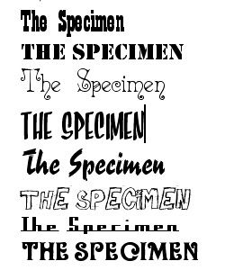 |
|
|
|
Post by lorelle on Sept 9, 2005 18:37:53 GMT 1
either the one 3rd up from the bottom or the pacman-ish one 4th down.
|
|
|
|
Post by danjkerry on Sept 9, 2005 18:45:00 GMT 1
3rd from bottom!
|
|
|
|
Post by scaredofme on Sept 9, 2005 20:34:54 GMT 1
G'yaar, Thee Olde Specimen Jar  Definitely the 3rd from the bottom. |
|
|
|
Post by eben on Sept 10, 2005 10:50:21 GMT 1
I like the one 7th down
|
|
|
|
Post by Rob on Sept 10, 2005 11:56:23 GMT 1
the starsky and hutch one?  the handwritten one and the pac man ones both seem popular. iv had this idea tho of changing the logo each issue and having some sort of catch phrase with each. for example, if we used the very top one we could have: The Specimen - Now with Go-faster stripes! or with the Pacman one The Specimen - Game Over. Please Insert 30p. or the Coca Cola one... Eat Specimen. Drink Specimem. Pay 30p |
|
|
|
Post by greasychipbutty on Sept 10, 2005 13:19:13 GMT 1
It doesn't matter what font you put my reviews in, you'll still cut them   |
|
|
|
Post by Rob on Sept 10, 2005 13:24:37 GMT 1
It doesn't matter what font you put my reviews in, you'll still cut them awww pooooor guesty  i'm sure eben will tell u that edits are a necessary part of the publishing process. my mum still reckons your reviews are the best bit of the magazine! thats motherly support for you!  |
|
|
|
Post by greasychipbutty on Sept 10, 2005 13:26:32 GMT 1
Lol
Screw you Robert! You just can't cut it!
I'm just kidding, I tend to overwrite stuff anyway so cutting is prob a blessing.
|
|
|
|
Post by eben on Sept 11, 2005 15:31:31 GMT 1
I only cut enough to fit reviews onto a page, it's not really cutting, it's subediting.
|
|
|
|
Post by greasychipbutty on Sept 12, 2005 17:56:56 GMT 1
Would you trim Picasso's painting so they fitted into the frame? I think not.
|
|
|
|
Post by eben on Sept 12, 2005 22:32:20 GMT 1
Have a look at The Guardian (which I might say is even better since the redesign), do you see articles where a few sentences go onto the top of the next page?
|
|
|
|
Post by greasychipbutty on Sept 12, 2005 22:35:40 GMT 1
Yes. (great new lay-out)
I'm working on a batman Begins review for you all to butcher...
|
|
|
|
Post by mralec on Sept 14, 2005 20:30:47 GMT 1
2nd or 4th from top
|
|
|
|
Post by greasychipbutty on Sept 14, 2005 20:56:33 GMT 1
Nicely steered back to the topic.
|
|


 i'm sure eben will tell u that edits are a necessary part of the publishing process. my mum still reckons your reviews are the best bit of the magazine! thats motherly support for you!

